paint-brush
A New Netflix Style Reality Show for People Who Love Databy@brightdata
748 reads
748 reads

A New Netflix Style Reality Show for People Who Love Data

by Bright DataSeptember 29th, 2022
Read on Terminal Reader
Read this story w/o Javascript
tldt arrow

Too Long; Didn't Read

Seven data influencers recently came together to compete for the ‘Iron Analyst’ title in the category of Data Analysis and Visualisation. Using a data set provided by Bright Data, the leading web data platform Each competing data wizard was given a mystery data set that was then required of them to clean, analyze, and create a spectacular visualization or dashboard. After the mystery data set was revealed, contestants were given just 1.5 hours to work with a set of Indeed job posting data provided by Bright Data. Every contestant was given a huge scale of data–over 40GB– that were broken into over a hundred different individual files to download and quickly analyze. Watch the full episode to have the newest Iron Analyst revealed!

People Mentioned

Mention Thumbnail

Companies Mentioned

Mention Thumbnail
Mention Thumbnail
featured image - A New Netflix Style Reality Show for People Who Love Data
Bright Data HackerNoon profile picture

What happens when 15 data professionals get together to create content? That’s right, The Iron Analyst!

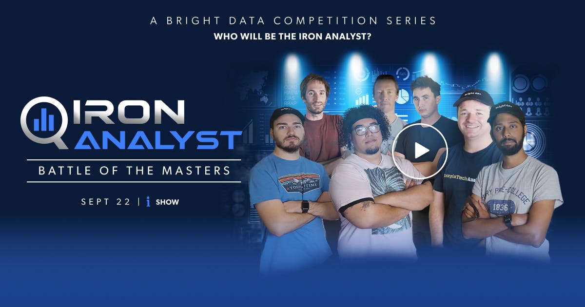
Seven renowned data practitioners recently came together to compete for the ‘Iron Analyst’ title in the category of Data Analysis and Visualization. Using a data set provided by Bright Data, the leading web data platform, each competing data wizard was given a mystery data set that was then required of them to clean, analyze, and create a spectacular visualization or dashboard.


Using a panel of three judges–notable data influencers Tina Huang, Ban Rogojan AKA Seattle Data Guy, and Josh Starmer–the projects were judged based on clarity, usability, and practicality.


The seven notable contestants, all data influencers, who competed for the title were:

  • Luke Barousse - Data analyst and Youtube creator
  • Avery Smith - Data Professional, Data Career Jumpstart
  • Shashank Kalanithi - Data Engineer, BetFanatic
  • Hunter Kempf - Data Scientist, Cloudflare
  • Keith Galli - Programming & Data Science, YouTube Creator
  • Mark Freeman - Senior Data Scientist, HUMU
  • Zach Wilson - Staff Data Engineer, Airbnb


Ken Jee, Data Science & Sports Analytics at Scouts Consulting Group, hosted the competition.


After the mystery data set was revealed, contestants were given just 1.5 hours to work with a set of Indeed job posting data provided by Bright Data. Every contestant was given a huge scale of data –over 40GB – broken into over a hundred different individual files to download and quickly analyze.


Each data competitor’s project was approached in a totally different and unique fashion, due to the diverse nature of each contestant’s data background. The data engineers, data scientists, and data analysts all naturally took a different route in managing and presenting the data based on their own personal framework.


“For the engineering approach, it's very much about getting something out, filtering, in order to get something out first as opposed to a data scientist or data analyst, they approach it in a linear fashion. I do think that the engineers have an advantage in this particular situation.”

-- Tina Huang.


And Tina wasn’t wrong. In the end, Shashank, a renowned Youtube creator and Data Engineer, ultimately took home the title of Iron Analyst for his organized, clear, and versatile visualization. The other two top projects that caught the attention of the judges were Luke’s and Keith’s.


Luke’s runner-up project, created with Power BI and Bright Data’s data sets, wanted to look at mainly job skill requirements and a comparison tool between top tools required for Data Science jobs across the US. While the judges loved it for its ease, simplicity, and clean design, judge Seattle Science Guy flagged concerns for the data counts seeming a little low. Luke admitted to the size of the data set being not feasible to fully address in the allotted time, so he only focused on the Data Analyst, Data Scientist, and Data Engineer roles.


Meanwhile, Keith’s runner-up project, created with Python, the Panda’s library, and Bright Data’s data sets, was enjoyed by the judges for the story it told. Keith developed a heat map visualizer directed at small-town kids with big career dreams, where places with the most jobs (all jobs - not just data jobs) were more lit up on the map. To handle remote jobs being so prominent, he cleverly found a small town in Oregon called Remote, which shone brightest due to so many remote jobs today being available.


Of the project, judge Josh asked “but was the graphic equivalent to the story?”

“The story matters a lot, doesn’t it,” responded judge Tina.


Winner Shashank took home the crowning title using Python and Bright Data’s data sets to develop a clever visualization of data engineering jobs across the US. He allowed the user to look at specific jobs or companies, the average company rating of all the companies the user selected, company location, and a subsection of salaries. When asked what the goal of his dashboard was, Shashank explained, “I would hope that this dashboard allows people to look at a wide swath of jobs all at once, in a data-intensive format, instead of individual jobs one at a time.”


While judges were impressed by all the projects created under such intense time constraints, judges liked Shashank’s the most because “it was a practical approach to things, and the reasoning behind why Shashank did it made a lot of sense,” said Tina from the judge’s couch.

Said Shashank after his win, “the web data and insights provided by Bright Data was just… mind-blowing. What you could actually do. For example with [most job postings] data, without an insane amount of work, you couldn’t get it… The ability to actually [have the data] and do this is something now that I really want to play around with after the meetup is done!”


You can watch the full episode of Iron Analyst, sponsored by Bright Data, here.